If you are lucky enough to be born with good vision, the world presents a kalidoscope of color back to you the moment you open your eyes.
Nature doesn't know how to subtly focus your attention with color and will use every crayon in the box when it is time for plants to bloom or for trees to shed their foliage.
Put bluntly, nature doesn't hold back on its deployment of color, using the entire palette.
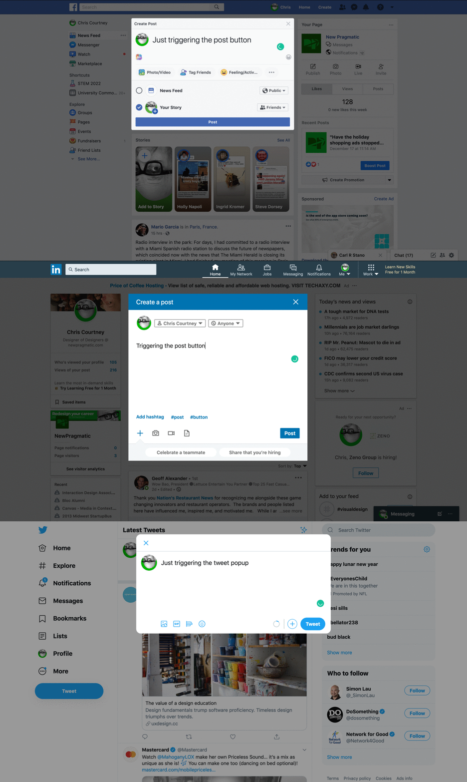
As children, we replicate that approach back to the world. We paint or draw what we see and often it's a very bright assortment with no sense of organization or pattern. As we grow older, we continue to absorb the world around us and as we look less and less at nature and more and more at our phones, we use fewer of those crayons and what we reflect back... well...
 Source: newpragmatic.com
While the GIF above oozes with damning sameness, it's also illuminating that humans can learn that clicking the blue button will ship the message. Perhaps more impressive is that companies with competing interests have agreed with one another to deliver the same interaction — because you as a user expect it!
This example of color usage and interface design synergy is something that was learned. It clearly doesn't come from nature.
In the resources below, you'll learn more about how color works before turning your attention to how color is used to steer decision making. You'll apply what you've learned to work through the exercises that follow.
Resources for review
| Article | Source/Author |
|---|---|
| Color at Work | New Pragmatic |
| Understanding Color Theory | 99designs |
| Visual Design - Color | Apple HIG |
| Material Design - Applying Color | Google Material |
Exercise
The more color is used, the less effective it becomes.
Using this Figma file, follow the instructions below to complete the exercise.
Part One: Study each of the designs presented. Using Figma’s color tool, identify the color palette and scheme for each design shown. Use what you have learned from the color chapters and the associated resources to guide your solution and feedback.
Part Two: The designs below replicate an existing iOS application focused on individual growth and discovery. I removed interface color usage to provide you with a clean set of elements. Your job in the first frame is to apply the color scheme presented to the design. Use what you have learned from the color chapters and the associated resources to guide your solution.
The second screen presented is the same as the first. As every application released tends to have a dark mode, your job here is to create a dark mode for the application using the same color palette.
Feel free to group and ungroup the examples as needed. This exercise is a test of your ability to use color, not an analysis of your ability to use Figma.
Once complete, update your Program Journal with links to the assets produced for this exercise. Post your Journal in the #Feedback-Loop channel for review.
///
Up next Form Design