From street signs to train station turnstiles, we rely on color every day to help guide our journey. Red stop signs, yellow caution signs, and green street signs all pass along helpful bits of information. These signs prime our minds to understand quicker because of the association with color. Additional factors such as placement, shape, and language can not be ignored but we spot the color from far away before we can make out the actual shape of the sign.
We’re not born understanding how to use color or what colors’ mean.’ People are conditioned over time to recognize the usage of color, and we form opinions and associations for those colors out of the experiences we have.
Just as users are conditioned over time to understand what colors mean, designers continue to develop an understanding of how to use colors in interface design.
Over the past hundred years, many new methods for distributing information have arrived, and they are generally devoid of color at the onset. Even the first home computers were without color monitors, meaning that the consideration of color usage was something that trailed the evolutionary leap.
This lack of color changed with the web, as most computers came with a color monitor by the time that Tim Berners-Lee introduced the concept to the world via a short post.
The early efforts were exciting. If the early ’90s era Apple.com homepage below feels like a simplified color wheel, that’s because it basically is.
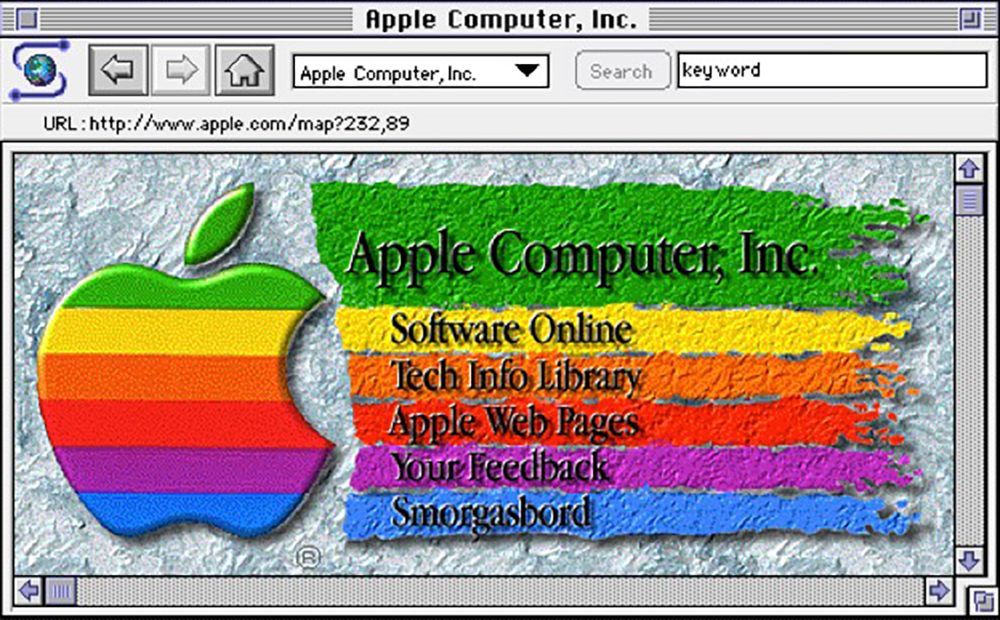 Source: apple.com
When the first commercial sites launched, there was a desire to splash color liberally onto the designs. The web was uncharted territory, and designers were beginning to see what was possible. There was no strategy around what was useful and what wasn’t. The only goal was to ship something and see how people reacted.
As decades, fads, and Flash past by, an appreciation for a purposeful usage of color emerged. While you can still find the combinations present in modern designs that are pulled directly from classic color theory, the actual usage is far more strategic.
Color for brand
When it comes to branding, few things resonate in our brain like the blue we associate with Coca-Cola or the trademark green that spans across McDonald’s arches.
Of course, blue and green are not the colors associated with those international companies. It’s your reaction to the statement that reinforces the fact that color itself is a critical component of any brand identity.
While color dominance defines how brand and color are associated, there is no universal rule that applies to how a brand’s color applies to an interface. In some instances, the brand color is nearly absent, with all visual focus provided by photos or illustrations. For others, brand color is a prominent feature; therefore, the designer leans heavily on the familiar brand/color association that already exists.
 Source: newpragmatic.com
As the sites above show, the more a brand’s primary color appears specifically for branding purposes, the less effective it is for other uses. It becomes tough to draw attention to a specific area when the color used already saturates the screen.
How we leverage brand color in interface design neatly introduces the concept of color palette and how we use color online.
All successful brands have a specific color palette and style guidelines for how to use those colors. Usage will change over time, and without specific study, it is far less apparent how color and guidelines are applied or how they change.
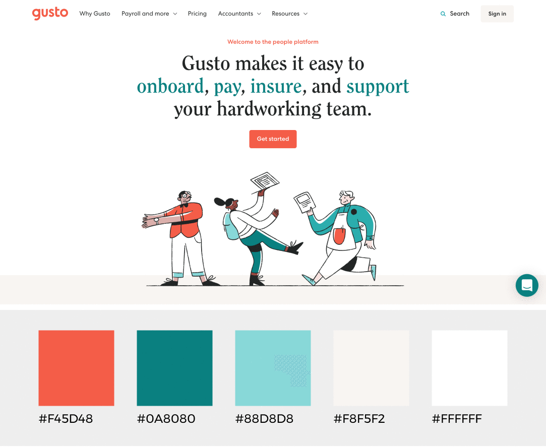 Source: newpragmatic.com
In the two examples above, both have relatively robust color palettes that provide the framework needed to construct many vibrant solutions. Yet, Gusto defaults back to a relatively grey presentation with colorful accents. Frog Design appears to opt for white type atop a video with only color usage applied to a box behind the logo. This approach is a bit of an illusion as Frog Design’s color usage only becomes apparent after navigating around the site. A wave of color accompanies each selectable option on the page.
 Source: frogdesign.com
The different uses of color above display different ways to provide your users with a target while navigating a site. What they offer in guidance is lost in simplifying the decision making for users of the website. In the next section, we’ll investigate how deliberate use of color with other design tools can significantly lighten the cognitive load for users.
Tools for working with color
| Tool | Platform |
|---|---|
| Colorsinspo | Online color tool with associated Figma plugin |
| Adobe Color | One of the original online color palette creation tools |
Color for direction
In visual principles, I referenced some of the different ways that you can help the user navigate through the use of shapes and space. In spite of its historical misuse, color remains a vital navigation tool. Since the launch of the web, color has indicated where links exist in a document - as illustrated clearly in the first web page to ever appear online.
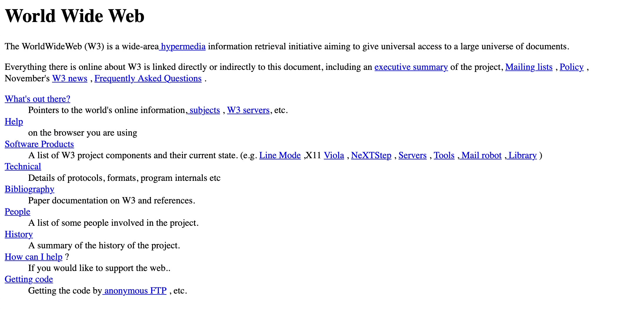 Source: info.cern.ch
The industry has been slowly inching back toward the simplicity displayed above. However, this early web document doesn’t precisely reflect the level of clarity we have come to expect from quality interface design.
While color has been a critical component in digital design since its inception, our expectations have evolved. Rather than merely displaying all the options possible, users expect an interface to anticipate user needs and guide their decision making. The interfaces you create will be a critical piece of the decision making process for your users.
We leverage color with other design tools to guide rather than display. Because of this goal, our usage of color has become more nuanced over time.
The previous Apple example resembles a grade school color wheel. Still, modern interfaces do a far better job of actually using the color wheel and the associated color schemes.

| Color Scheme | Description |
|---|---|
| Monochromatic | Single dominant color, accompanied by usage of black, white, and gray. |
| Complimentary | Two colors, opposite from each other. One-color is dominant, while other is an accent. |
| Analogous | Three or four colors, in sequence to one another. One-color is dominant; another is secondary, with the remaining two acting as accent colors. |
| Triadic | Three colors, equally spaced from each other. One-color is dominant, while others are accents. |
As illustrated in the display above, traditional color schemes are present in modern design. Still, successful schemes all have a dominant color that powers the design. How each scheme is employed changes from one design to the next. The options below do an excellent job of highlighting the possibilities with each.
Monochromatic
In each of the examples attached, you’ll find a single color carrying all navigational duties. Sites like Creative Bot and Blue Bottle Coffee use the color scheme for mostly navigational purposes and allow a host of grey tones too provide structure elsewhere. Netflix ’s usage is very similar but uses images to provide a background for the site.
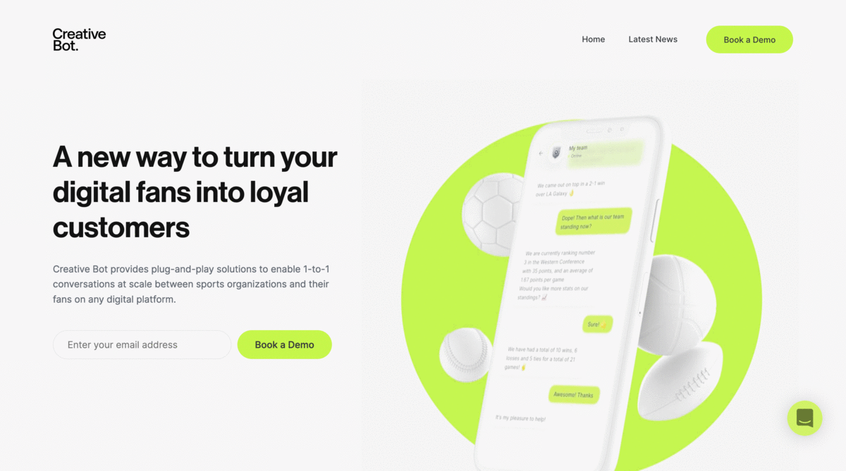 Source: newpragmatic.com
The reliance on a single color ensures that any usage of color will draw attention. The downside to this approach is that it can be very limiting as it doesn’t allow room for other usages of color for things like confirmation and warning messages.
Complementary
As you stretch beyond using a single color, your options open up significantly. Complementary color schemes are incredibly popular mainly because they operate at extremes. Selecting colors from opposite sides of the color wheel creates maximum contrast. This expansion also addresses an issue with secondary usages that might not be immediately apparent. It becomes far easier to display feedback when you have a contrasting color to use.
Much like Netflix, Lufthansa uses color sparingly on top of images. With the secondary color reserved for navigation, the dominant color can be used for branding. eTactica boldly splashes the dominant color across the page, knowing that their secondary color will still call attention when needed because of the contrast created. Wibbitz and dubasdo are far more refined in their approach, layering in several tints or shades of their chosen color. This further refinement pushes the site forward while retaining a relatively uncluttered design.
 Source: newpragmatic.com
Consistent usage of color is a strength that modern efforts do a better job of displaying. However, it is the combination of color, space, and size together that elevates the tools to aid the user in decision making.
Beyond
Color operates much like good typography. The fewer options you use, the less likely you are to screw it up.
That said, While the vast majority of modern designs utilize the prior two color schemes, it would be foolish to say that those are the only schemes used. There are many sites (like the ones below) that attempt to use more elaborate color schemes.
 Source: newpragmatic.com
If there is one statement that I have used time and again regarding color, it is this — it’s not the colors you choose, it’s how you use them.
You will be presented with some questionable selections to use in your career (some blatantly bad ones await you in the exercises attached). You will have to work within the boundaries set forth by really annoying corporate style guidelines.
It is not your job to whine about them. It is your job to thrive within those constraints — and then constructively educate your clients, bosses, and peers on ways to improve what they have.
Associated Exercises
| Name | Section |
|---|---|
| Color Accessibility | Interface Design |
| Color At Work | Interface Design |