The beep of an alarm. The click of a closed door. The illumination of an elevator button pushed.
What we sense and the actions that occur are often separate things, yet in our mind, one does not happen without the other. This the influence that feedback has on our daily lives.
Just as feedback is a crucial component of a physical world that ‘just works,’ we rely on feedback from our digital world in every form imaginable.
A simple blinking cursor often informs a user both where they can type and that the machine or program is eagerly waiting for input. Directional arrows usually indicate items that contain more information to consume. Confirmation messages assure us that our instructions were received. In-app notifications make visible the hidden processes that lurk behind the facade of the interface.
Are there more types of feedback? Absolutely. We haven’t even discussed things that buzz or listen, but before we dive deeper into direction, let’s first address when feedback occurs.
Timing is just as important as form when we are talking about the usefulness of feedback. When delivered at the right moment, feedback is a priceless commodity that allows users to remain calm in a stressful world. However, when this communication loop fails, the failure is likely a matter of execution, rather than effort. We’ve all experienced an overload of notifications or the delay of late alerts. It isn’t a stretch to say that too much or inconsistent feedback is often worse than no feedback at all.
Before we can address timing, we must first understand the various forms that feedback can be delivered in. Use the resources below to grow your knowledge of this critical aspect of interface design.
States
All functional digital products are capable of providing feedback to users. How the feedback manifests itself is typically determined via a combination of timing and a change in appearance or tone. For visual interfaces, the change we are talking about is generally represented by one of the following states:
 Source: newpragmatic.com
The states displayed above are following the naming conventions provided by Google’s Material Design documentation. Each state can take on slightly different naming conventions as you migrate from one design system or framework to the next, but the state is generally present in most instances.
Navigation components like navbars, forms, buttons, videos, modals, and more all have some combination of these state change associated with them.
Confirmation
The role of confirmation is to both protect the user and put the user at ease. Rarely do both occur at the same time as the form of each often relies on timing.
When protecting the user, the point of confirmation is to help the user avoid unintended destructive actions. These are dominated by dialog boxes or popups that occur before the action takes place.
As displayed in the example below, the language and structure of a confirmation dialog can provide valuable affordance that protects the user - while also freaking them out just a little.
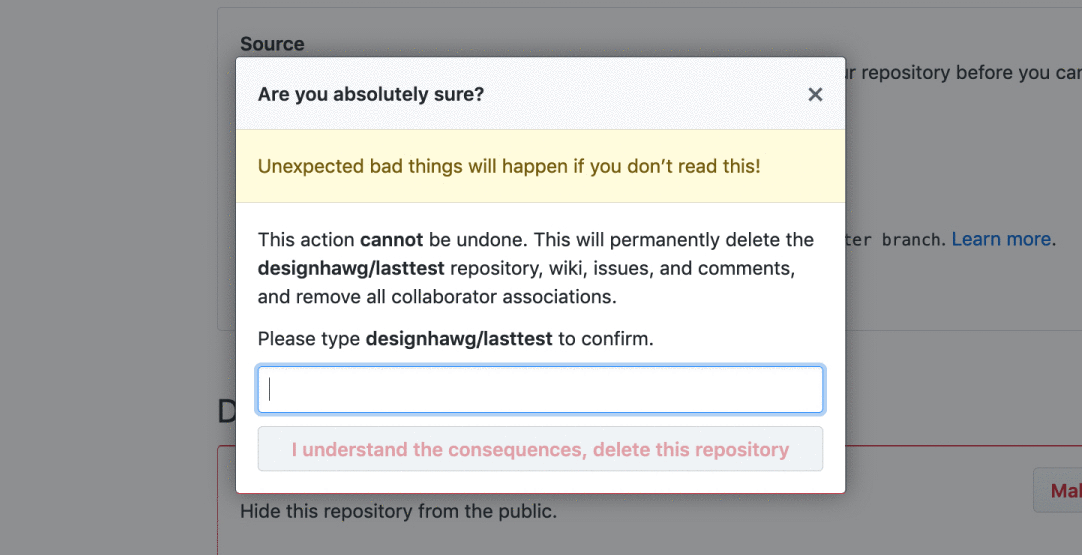 Source: newpragmatic.com
While this adds a step for the user to complete, it is far less painful for all involved than allowing the user to perform an action that may not be easily undone.
On the other side of the spectrum is the confirmation page. These typically follow a successful action or transaction and are often paired with a confirmation email.
 Source: newpragmatic.com
Unlike the dialog of death that can scare users away from making mistakes, confirmation pages are friendly and only aim to set us at ease.
Permission
As concerns over the privacy of personal data have captured more attention, the concept of a digital product seeking your permission has grown exponentially over time.
Permission has always lagged behind other aspects of digital feedback, but over time innovations like the smartphone pushed the issue forward in the absence of proper regulation.
 Source: mobbin.design, newpragmatic.com
The smartphone revolution inserted a bevy of new tools into the hands of users. Few really understood why seeking permission to use your camera or location was even needed. As time passed, the public began finding out that their data was being stored and harvested — even if they opted out.
In 2018, a steady flow of stories about data abuse led companies and governments to shift their focus to user rights and security. Previously, permission was limited to things you did with your mobile devices. Now, most digital products, sites, and services request for some form of consent before you begin interacting with it.
 Source: newpragmatic.com
While US companies danced around their commitment to protecting user privacy and data, the General Data Protection Regulation (GDPR) was passed by the European Union in 2018 to make it illegal to collect user data without first seeking permission. This led to a significant increase in the number of popups and banners that appeared on global websites. While some implementations are quite annoying (especially when combined with other messaging), the GDPR is a step in the right direction for user privacy.
Format
If there is anything universal in the way feedback is delivered to users, it is that timing is more important than style. Provided that you are giving feedback when the user actually needs the information, you can always improve the way something looks visually. On the other hand, a great visual solution can’t overcome being delivered to the user at the wrong time.
While many timing issues are relatively easy to spot, feedback problems are quickly illuminated in user testing sessions. The participants in your research cohort can provide the fresh eyes needed to spot feedback issues that are lurking.
Resources for review
Exercise
In this series of exercises, you’ll have the task of developing UI elements that provide the proper form of feedback. Using the provided Figma file carefully read the instructions below, make sure you are tackling the requirements of each exercise as the type of feedback you will provide will vary from task-to-task.
Part one: The links inside the navigation bar provided lack the visual feedback needed to indicate when a link is active, hovered upon, or selected. Use the elements provided to build the required visual style for each state listed.
Feel free to replicate the assets and break them apart to accomplish the task at hand. Your final work should illustrate the various states, but please label your work appropriately.
Part two: The dashboard presented in this exercise is intended to display a list of participants, but the user is just beginning to set up her account.
Your client has provided suggested language to include for this empty state — it’s your job to determine how to use this information or whether additional controls should be added.
Part three: When a user interacts with our product, there are pivotal moments when confirmation is required.
The frames provided are instances where the user has taken action, and confirmation is needed to assist the user or put the user at ease. Your task is to determine what form of confirmation to use in each instance.
Once complete, update your Program Journal with links to the assets produced for this exercise. Post your Journal in the #Feedback-Loop channel for review.
///
Up next Components