
Evolution rarely occurs without something initiating the change.
Like design, dance has taken many forms throughout history. For hundreds of years, dance innovations were driven by local music and culture. While localized styles emerged, they didn’t change much until innovations like the record player and the radio pushed ideas into new places.
Soon thereafter, dance began to evolve as new music styles emerged and were shared rapidly across the landscape. Dance wasn’t changing spontaneously on its own; it was developing to match the music around it.
Older practitioners shunned new dance crazes, but occasionally a dance would impact the larger cultural dialogue. During this transition from novel to the mainstream, the dance is modified for consumption by a broader audience.
Design works in much the same way.
There is a timeline of events that occur before and after during a transition. Preceding the struggle is a period of creativity, and the experience from one product to the next is so radically different that it drives away any casual user. When the phrase “it’s like the Wild West” is used, you can be sure the reference is rooted in frustration with this early adoption period.
Soon, evolution kicks in, and a handful of ideas take root across the ecosystem. With each pattern that is adopted, the design landscape changes, and with it, so does the concept of “useful.”
Design has had plenty of exterior factors to react to over the past decade. For instance, the smartphone radically altered the design patterns we use and what we deem to be ‘easy to use.’
 Source: cyrilmottier
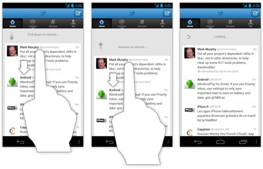
Pull down to refresh is a prime example of UI pattern that grew from a fringe existence in a single app (Tweetie) to be a built-in part of both Material Design and Apple’s Human Interface Guidelines.
Our excitement around these winners quickly fades as they become part of how something is ‘supposed to work.’ As time moves on, experiences that incorporate enough winning ideas become ‘easy to use’ while many innovative ideas fade.
Users value function, which means that they gravitate to things that feel familiar.
This can all lead to a lot of frustration for designers.
Still, innovation in existing fields is possible — when supported by the right number of established design patterns. Design revolutions are rare, but design evolution is constant.
With that in mind, let’s discuss some of the existing design patterns that should be present in some form throughout your work. By ensuring these have a home, you can spend significantly more time solving your project’s bespoke aspects.
Common patterns
Depending on the source, you can find dozens (even hundreds) of design patterns in use across the spectrum of digital products. Here are some of the significant trends that users encounter daily.
The flow of information
Since the beginning of the web, people have debated how information should be displayed.
Out of those discussions and follow-up studies, three patterns emerged that would drive web design forward. The F, Z, and Gutenberg Diagram patterns have largely dominated even as advances like responsive design have challenged the need for such rigid systems.
Many designers have leveraged the F-like patterns for content heavy presentations and dashboards. The Z pattern and Gutenberg Diagram have represented the ideal solution for sites with a lighter content load, like marketing pages.
 Source: newpragmatic.com
There is some value found in these systems when viewed as a collection.
- The most important information always appears at the top.
- There is some value to anchoring information in the left rail.
- Users generally begin pages in the top left and then move downward.
It is important to note that even these attributes are largely dictated by language and not design. While western languages like English and Spanish move left-to-right, Hebrew and Arabic flow right-to-left. While this directional switch completely flips the user’s consumption patterns, a mirrored version of the patterns described above can be applied.
Conversion mechanisms
Profit motives aside, all organizations want more users of whatever product or service they are offering.
The best way to reach this goal is to display and deliver value quickly while providing the most straightforward pathway forward. What that pathway looks like will depend significantly on the situation.
One of the most notable innovations in this area is Amazon’s 1-Click checkout flow. The ability to buy things from Amazon by pressing a single button was such an innovation that Amazon applied for and received a patent for the work. Some companies like US bookstore Barnes & Noble had to settle lawsuits for copying Amazon. In contrast, others, like Apple, paid a fee to Amazon to utilize the innovation.
 Source: amazon.com, newpragmatic.com
That patent expired in 2017, so now virtually every online retailer offers some form of the design pattern — where appropriate. This is an important distinction because even Amazon has realized one-click shopping doesn’t apply well to all items. For digital items, like books, movies, and music, one-click is a logical offering. Physical items often require additional information, like shipping instructions, which inserts more friction into the shopping process.
 Source: amazon.com, newpragmatic.com
‘Buy It Now’ presents a middle ground that more sites are now employing, provided the user has established an account with completed payment and shipping details. This alternative method is often referred to as an dynamic checkout, and has been adopted by payment services like PayPal and Apple Pay.
If you create any form of eCommerce site or experience in the years ahead, you can count on users expecting 1-Click or dynamic checkout options to be available.
Wayfinding
Earlier I brought up the issue of frustration. There’s no shortage of ways that users can become frustrated with the experiences we create, but having a product that is difficult to navigate ranks high among them.
For many years, designers clung to the 3-click rule — an unofficial heuristic that claimed any information on your site should be delivered to the user within three clicks. At the same time, this wasn’t a terrible goal, the Nielsen Norman Group debunked the rule as it encouraged poor design decision making.
It turns out that clicks are not measured equally. Rather than forcing users to click around on multiple links in search of the desired content, we should leverage design patterns that display more options for wayfinding than fewer. Mega menus, like the one shown below, are a great way to elevate several related options with a single click.
 Source: newpragmatic.com
Another helpful, but often forgotten wayfinding tool is the traditional breadcrumb. A staple of the early internet, breadcrumbs fell out of favor but provide users with the exact path that brought them to their current location in a given site.
If people are frustrated because they are lost, at least put up some street signs.
Finally, merely writing more precise descriptions and labels would remove confusion from the interface for many users. NNG says this approach provides information scent, and I agree with this logic.
Filtering
What do YouTube, Amazon, and the New York Times all have in common?
Each has a gigantic library of content, easily eclipsing millions of individual items apiece.
Like gold, content can be precious, but both are worthless if people are unable to access either.
However, the value of gold is driven by scarcity. It’s hard to find, and when you do find it, you hang on tight. Content is often the opposite of gold. Rather than being hard to find, the volume of material we encounter in a day is often overwhelming. Content is also unique because it’s value varies from user-to-user.
Take the average story you might find on a website like the New York Times. Some articles will be valuable to you, while most are worthless. The goal of the team at the Times is to make it easier for you to find the stories you deem valuable, which is partly made possible by robust search and filtering capabilities.
 Source: nytimes.com, newpragmatic.com
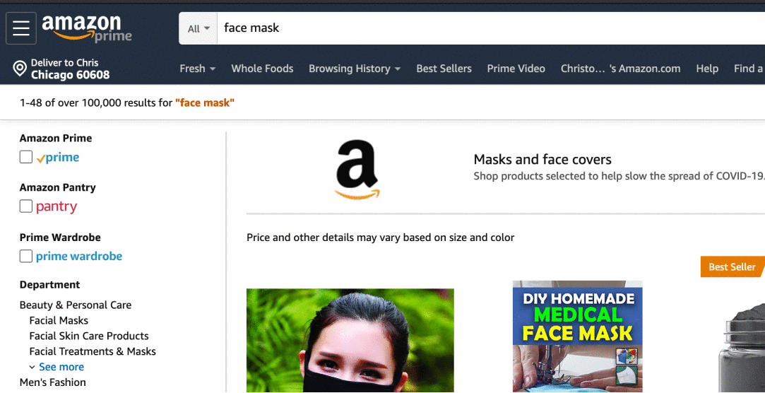
While it would be appealing to adopt the NYT model of filtering across the web, it wouldn’t be robust enough in some instances. For sheer scale, it would be hard to top the number of items that Amazon has in its database of products on any given day. The search shown below for a ‘face mask’ generated over 100k results. As your search results expand in size, you have to increase the tools you make available for users to sift through that information.
 Source: amazon.com, newpragmatic.com
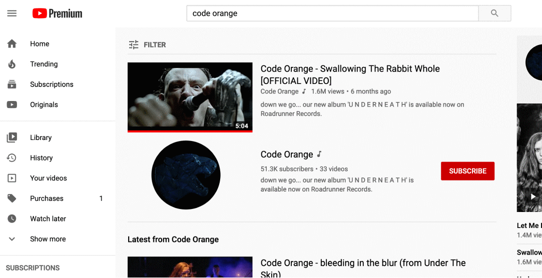
Rivaling Amazon for the number of items might be YouTube. The video platform had close to 1000 hours of content uploaded since you began reading this section on filtering content.
Unlike Amazon or the New York Times, most of the content is uploaded to YouTube from users. This means that it could be challenging to filter some content because of inconsistent data collection on upload. For YouTube, the filtering focuses on aspects that aren’t provided by the user, like video quality, time of upload, length of file, etc.
 Source: youtube.com, newpragmatic.com
Though each approach is different, the constant between them all is a common goal to simplify the process of navigating through information. If you can make it easier for people to find what they are looking for, then you’ve added value to your project.