The success and failure of most adventures rest on our ability to make the right decision at the right time. We can all remember a moment when we have made the wrong decision, and it resulted in a negative outcome. The pain associated with the mistake, whether physical or mental, seared that moment into our minds and the lasting impact of that moment can alter how we feel about particular people or places.
Success is altogether different from pain. We might momentarily remember the first time we successfully rode a bike or baked a cake, but all subsequent victories have long since washed away. This phenomenon stems from how the mind deals with interactions. For the brain to tackle more complex issues, it relegates simple tasks to the subconscious.
To tilt the odds of converting a user into a customer, designers should put ample focus on creating intuitive products and services. Some of this will be done via visual design or later with interaction design. However, the bulk of that work will occur when we are determining how people will navigate through our work.
That means the messages, icons, and words that we present to people are just as important as the product descriptions, mission statements, posts, and videos that make up the bulk of our content.
The importance of this job is clearcut. Either we are aiding visitors, or we are hindering their ability to reach their goals.
In her book Conversational Design author Erika Hall created a set of principles that guide us toward being helpful to our users.
- Quantity: Provide only the information needed
- Quality: Build trust through communication
- Relation: Establish cooperative communication
- Manner: Express ideas quickly, clearly
- Polite: Make the user feel good
While Hall’s book focuses primarily on communication via voice and chat driven interfaces, the principles work quite well when applied to content on a homepage or packaging.
Clear, helpful direction that does not overwhelm the user is your ultimate goal. Achieving this will result in satisfied visitors and ultimately, more customers over time.
With this in mind, let’s journey into the types of microcopy that you’ll be creating.
Micro victories
The helpful call-to-action button, reassuring status notification, humourous detail, or meaningful alert message can do wonders to establish a bond with your user.
These elements represent how we transact business in your project. Click this, buy that, watch out for this other thing — all done to make the streamline the experience for users.
Creating a seamless experience is something you have to do because most users are not experts on using your product. Every time you manage to move that person closer to their goal while using your service, you move that person a little closer to becoming a customer or supporter.
Tiny victories are rooted in the ability to add clarity to user activity.
Let’s get to work.
Call-to-action elements
The workhouse of nearly every interface is call-to-action elements. We use them to guide users to log in, sign up, view demo, and start a trial.
Technically, everything on a homepage could be a CTA, but we often apply visual weight to particular actions that we want people to take. Our design helps guide the user and simplifies the choices they have to make.
Perhaps more impactful than the visual cues is the language that we use. You always want to be transparent about the action that will occur when the user decides to press the CTA.
 Sources: mailfold.com, mailchimp.com, visible.vc
‘Start A Campaign,’ ‘Pick A Plan,’ and ‘Start Your Free Trial’ are more descriptive than ‘Get Started,.’ Being sure about what will occur once an option is selected is an easy way to lower cognitive load for the user. We want users focused on whether or not to create an account, rather than wondering what happens when they ‘get started.’
Navigation bars
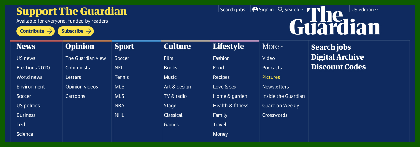
The ubiquitous navigation bar is intended to display the most popular set of options without being too cluttered. The names given to sections should be short, use standard terminology, and be easy for users to understand. This example from The Guardian illustrates these principles well.
 Source: theguardian.com
Dropdowns
Your main goal with dropdowns is to avoid making them annoying to use. Know that users hate dropdowns that force them to scroll to see additional options. You’ll encounter most of these in forms, but they do appear in homepage navigation bars from time to time. As the examples below display, a logical range of 3-to-10 items is acceptable in a dropdown.
 Source: patreon.com, revealbot.com, zibbet.com
We should refrain from using a dropdown for anything shorter than three items and allow the user to click a link instead. The longer a dropdown is, the more we should consider alternatives like the megamenu (displayed in the next section.)
For long dropdowns in forms, try to weight the items by most popular use. In a list of countries, a subset of countries should appear at the top of the list. A company based in the United States would likely have a different subset selected than a company based in India, so this change is location-specific.
Megamenu
Over time, the megamenu has become a staple of website architecture.
The megamenu is useful because it affords you the space needed to display complex site structures without overwhelming the user. The method works best when it maintains focus and hides or obscures a significant portion of the screen, thus simplifying the decision making. In The Guardian example below, they expand their dropdown to display other options logically grouped with appropriate sections of the navigation bar.
 Source: theguardian.com
Megamenus can also include images, as the example from Amazon displays below. This display further lightens the cognitive load because of the change in information density on the screen.
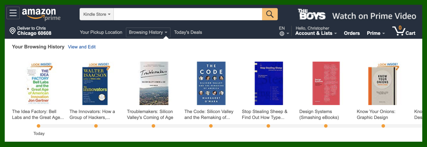 Source: amazon.com
As with any tool, it is possible to misuse megamenus. Not every site requires one and websites that could benefit from them often stuff too much information into the element. Good editing is still a ket requirement.
Empty State
There are moments in every journey where the user confronts a form or field awaiting interaction. This instance is the digital equivalent of a blank sheet of paper, which famously strikes fear into its prey — by being so blank.
In these instances, humans aren’t sure what to do next. There are blank forms to fill, empty dashboards to populate, open seats to select, etc. The trick is to spur the user into action.
 Source: hyatt.com
In the navigational form used by Hyatt they have included placeholder text in the form field to suggest locations the user might choose. Additionally, they have also pre-included a date range. This aspect might not seem helpful at first glance, but the inclusion of dates sparks the need to input the proper dates more often than leaving the fields blank.
 Source: webflow.com
Moments of wit can work to your advantage when elevated at the right moment. Prototyping tool Webflow strikes the right cord when a new user encounters an empty dashboard.
Filtering and Sorting
When a user performs a search, they can’t find what they are looking for and want us to find it for them. In instances where search queries return a page or more of possible options, we need to include ways for them to filter or sort the results.
Filtering hide options that do not pass through the filter applied while sorting mechanisms reorder the items based on the option selected.
 Source: target.com
In the example above, Target has robust filtering options that change based on the product that is displayed. Determining what these options should be is an important consideration to test with users before being implemented in the product.
The number of ways that you could filter search results is limited only by the subject matter displayed. Sorting is relatively restrained — mostly limited to price, time, ratings, and availability.
 Source: hipmunk.com
There are notable exceptions, as seen above in this Hipmunk example where the travel site has combined possible sorting mechanisms to create a new option. Their ‘agony’ sorting allows the website to empathize with travelers while also injecting a bit of humor into a user’s ongoing search for cheap travel options.
Forms
Where and when you ask for user information is important. Airlines would sell far fewer tickets if they required the data for each passenger before allowing you to search for flights. As seen in the example below, only information about where you are going is required for you to see the options available. Once you select your flight, then additional information is sought to complete the purchase.
 Source: jetblue.com
There are many structural considerations for forms that we’ll dive into in later chapters. For the moment, I want to table those to focus on an issue that is much more menacing.
It wouldn’t seem possible, but in the tiniest elements of a site, you can inflict the most damage to a user with a poorly considered form. The issue isn’t because of the form itself, but what we do with the information we collect from those forms.
You shouldn’t seek information that won’t help you serve the customer.
If your company delivers products to users at a physical address, then you certainly need to collect that information to perform the service. However, you won’t need that type of information if the user is signing up for a newsletter.
Shorter forms are more likely to be completed, which lowers abandonment significantly. More importantly, by collecting less information from users, we expose them to fewer risks — including risks that we can not currently fathom.
Activity messages
Some activity is required to trigger this assortment of confirmation messages, errors, and warnings. These hidden elements are often the difference between an uneasy user and a confident one.
The delivery of this collection of messages happens at a particular time. That means the user needs assistance or looking for confirmation when the message arrives.
Many of these messages are to put the user at ease by providing feedback. The assortment of messages shown below confirms to the user that an action took place.
 Source: airtable.com, figma.com, google.com
Related to the empty state prompts that we covered earlier, hints and tips also play a role in spurring activity from users. These are particularly helpful when we add new features or when you are on a mobile device and relying on gestures that aren’t visible to the user.
 Source: airtable.com, figma.com, google.com
Perhaps the most crucial time to deliver the right message is when the user is stuck. When that happens, our primary job is to get them unstuck as quickly as possible. The error messages shown below are attempting to address the same problem. The option on the right is preferred because of its clarity and positioning.
 Source: github.com, material.io
Error messages and warnings can appear anywhere in the flow of a users journey through your project. These bits of communication are the details that determine whether you are creating something that helps — or hinders.
Not all microcopy is helpful
It is crucial to realize lousy writing isn’t strictly the domain of poorly written blog posts. To our users, bad writing can spring up in a wrong word or phrase. Sometimes it is a hapless error, but far more often, this activity is carried out on purpose. Take confirmshaming — the act of shaming a user into becoming a customer. It doesn’t seem like something that we would want to do on purpose yet, as illustrated in this example from DailyLook, this is terrible writing with a purpose.
 Source: dailylook.com
Some of the more egregious examples won’t require visual assistance:
- No thanks, I hate hugs.
- Nope, I don’t care enough.
- I am a bad person.
Confirmshaming isn’t just a bad, it also violates every rule for productive dialogue.