Take a moment and imagine how society would function without the printed or spoken word.
Language is one of the most significant inventions, yet few designers invest time improving their ability to use language. This lack of investment is ironic because communication is one of the main things we do.
Language has been with us for a few thousand years, so the Internet is still an infant by comparison. Like language, the Internet has changed how humanity communicates with itself. For all of the technological advances the Internet represents, the vast majority of communication that happens online is via the written word.
For all the debate over whether designers should or shouldn’t code, how a designer writes has been getting far more attention as of late.
“Experiencing bad writing will leave a customer with a bad taste in their mind. And will leave them thinking that a product is bad and doesn’t deserve a second chance,” designer John Maeda said on the matter.
He’s exactly right. Bad writing erodes trust with the customer just as quickly as a defective product or bad press, but ‘writing’ frames the problem too narrowly. Making a poor image selection or using the wrong interaction can have the same result as bad writing.
In this chapter, we’ll focus on the more substantial content elements and look at them holistically as they work together to guide the user on a journey through an experience. In the next chapter, we’ll study how the details can create both helpful and harmful signposts along the way.
Let’s start our journey, where all projects first begin — with nothing but a blank slate.
Content creation
Someone or something created every bit of content you consume. None of it appeared without a measure of consideration put into the construction of it.
Regardless of your role on a design team, you will create content at some point in your career. Whether it appears on the homepage of the company website or in progress updates to the internal team — we all create content for an audience.
As illustrated in the Patreon example below, it is impossible to communicate without content.
 Source: newpragmatic.com
Creating content and writing for the user experience means that we have to adjust the way we deliver our message to fit the constraints of the task. What we say and how we say it might change, but if we adhere to the needs of the situation, you should hit the mark.
Writing for the user journey
When setting the boundaries for UX content creation, it would be easy to say “everything,” but that would fail to frame the issue properly.
Our job isn’t merely to provide content. We need to tie the elements together, so there is a cohesive handoff between the steps of the user experience.
From user research and personas, designers know both the problems and goals for the target audience. When that audience encounters a site or project we’ve worked on, they need to see a solution to their problems displayed back to them.
In the book Building a StoryBrand, author Donald Miller points out that people seek out solutions. If it is hard to tell how you’re product or service can help, then you’ve already lost.
Miller refers to this as the Grunt test. In short, could a neanderthal (cave person) understand what you’re offering? Most companies that introduce themselves to a customer as a solution to a problem pass the Grunt test.
In each of the examples below, each company is presenting itself as a solution to a problem.
 Source: infermedica.com
 Source: prosperops.com
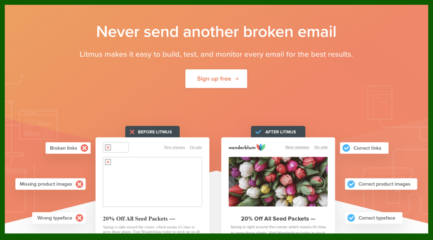 Source: litmus.com
In each example, both the words selected and the visuals displayed have a purpose — and they reinforce one another. When you are focused on excellent communication, you avoid creating content for decorative purposes.
A quick spin through LandBook will surface countless examples to put against Miller’s grunt test. Many will pass, but quite a few will fail — many from large organizations.
How success is measured internally will vary. Some organizations will want to focus on the customer bounce rate and plead for changes if the rate is high. I want to encourage you to look at another metric for measurement — conversions.
Visitors can leave a site for many reasons, but the most obvious is that those visitors are not the target audience. A far better measurement of progress for your endeavor is the number of visitors that engage and convert into users or customer.
The user’s journey from initial engagement to conversion takes on additional weight as they get closer to commitment.
As an example, let’s look at the language typically involved in a checkout process. The scenario is one that we have encountered either in person or online any time we’ve purchased something.
Without looking at the interface for Amazon’s checkout process, you can follow what is happening just from the prompts found within each call-to-action (CTA) button.
- Add to cart / Buy now
- Proceed to checkout / Cart
- Use this address
- Place your order
The CTA’s above convey only the information needed, and are easy to understand.
Amazon has studied the sales funnel quite carefully, and for a good reason — cart abandonment hovers around 70%. Which is why the final two steps of the sales funnel for Amazon carry additional information to help establish trust with the customer.
 Source: newpragmatic.com
Depending on the type of product or service you are building, the data you collect will direct your attention to improving the user journey in specific areas. Sometimes it is the classic cart abandonment issue, other times it is a message that fails to capture the attention of prospective users on a homepage. In either instance, it is a content problem that is impacting the user experience.
To turn the tide on content issues, we need to focus our attention on how we are determining priority in our messaging.
Structuring by priority
In a world that perceives all design by visual artifacts produced, you will encounter enormous pressure throughout content creation to begin creating sketches and wireframes. The desire to see direction and form is natural as people are generally excited about progress — especially progress they can see.
Content creates weight and structure of its own that will often dictate a solution. To begin creating wireframes or other visual guides, we would effectively be ignoring the importance of the content itself.
Priority Guides is a method that allows the content to determine the order and later appearance of a page or site.
As someone who has tried to wedge information into predetermined shapes dictated by early wireframes, I can confirm that Priority Guides is a better way forward.
Creating a guide is straightforward.
- Most important thing
- Next important thing
- Least important thing
You get a clear picture into the priorities of a company when you apply this concept to an existing site. Let’s boil down one of the world’s most profitable companies, Apple, into a priority guide.
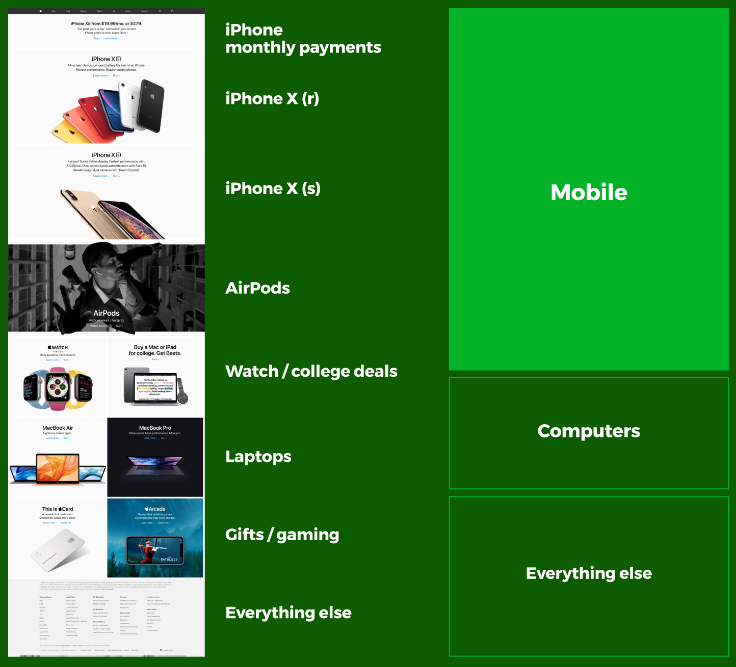 Source: infermedica.com
While it won’t surprise anyone that Apple puts a high priority on its line of iPhone devices, it is somewhat surprising what is absent. No mention of its new high-end computers or displays. No mention of Apple Music or Apple TV. No iPads or Apple Pencils.
Priority guides are excellent because they strip away everything that isn’t directly related to content and allow us to focus on what we are attempting to communicate. Priority guides are not to be confused as simple tasks though as they each require time. Here are a few of the rewards that your patience will gain:
Iteration The closer you get to wireframes, the harder it becomes to change the overall design of your project. The lack of investment in visual design allows you to iterate faster. Priority guides will evolve from version-to-version as you identify holes and tightly edit your work. In the example below, you can see that a lot of work has pushed the second iteration of the priority guide forward. Another iteration awaits as there are no supporting elements for the initial details added.
 Source: newpragmatic.com
Real content Long gone are the days when it is acceptable to say ‘content TK’ on a wireframe and scribble a box. Working with real content allows you to design with actual content later. As stated above, content creation is where the bulk of you will spend the majority of your time when creating priority guides.
Mobile by default Because you haven’t bothered to wireframe the visual design for a large screen, a priority guide aligns your work immediately for mobile-first. Instead of optimizing for a phone (majority market),’ you’ll later optimize for desktops and tablets (minority markets).
Testable You can rarely extract useful feedback from a sketched wireframe from anyone not directly associated with your team. However, users can react to priority guides because they have actual content that will register a reaction from a tester.
You can apply this method to any content, which includes content provided by the client. However, merely plugging content into your work without adequately considering the value of the material provided could be disastrous.
It’s time to develop a critical eye for content analysis.
Content analysis
Designers interact with work in a variety of forms. Few projects will involve starting from scratch or arrive prebuilt with all the parts you need. Because of this, your ability to analyze content will be just as vital as your ability to create content.
Content Analysis is the act or reviewing content for reuse, repurposing, or editing into a new form. While starting from scratch sounds easy, you’re going to encounter situations where content either already exists or has been created for use.
Any product or site redesign falls into the realm of extensive content analysis. You are far more valuable to your client if you can assess the quality of existing content and put it to use.
Most of the time, you’ll be working on top of an existing structure that requires some form of edit or update. Wiping the slate clean and starting over doesn’t happen. That’s because in the content your client has already created holds significant institutional knowledge. Regardless of how malformed it may be when you first encounter it, you can extract value from it.
While you won’t be performing content analysis during this portion of the course, it is helpful to understand the concept at a high level.
When you are digging into a trove of existing content, it’s easy to get lost in the volume. While there are ways to perform quantitative audits using tools like Screaming Frog, producing reams of data won’t help you find the story of the site.
In the outstanding book Everyday Information Architecture, author Lisa Maria Martin lays out a roadmap for understanding the content from a qualitative perspective. These questions will help uncover the value of the material that you have while also providing a glimpse into how the client will manage the work after you finish.
- What kind of content is present?
- How is the current website structured?
- How effective is the content?
- How is the content managed?
Regardless of the size and scope of a project, you’ll likely be working with either preexisting or provided material. Understanding how to weave together the needs of the user to establish a logical priority for how the content will be delivered is a useful skill to continue developing over time.