
Before a designer can begin to design with color, it is important to understand the scope of the challenge ahead.
If you are a designer blessed with 20/20 vision and do not wear corrective eyewear, understand that you are a minority. Only 35% of adults naturally have perfect vision, while the number rises to 75% when counting adults with glasses, contact lens, or surgery.
Still, these corrective measures aren’t enough to address the issue. Globally, more than 900 million people have some form of visual impairment. Add 40 million more to that number if you count people who are considered blind.
Now that we have the scope of the problem in mind, let's zoom in a bit on a problem that you can play a direct role in addressing today.
Roughly 8% of all men (1-in-12) suffers from some degree of color blindness. The percentage is much smaller among women, but when you are talking about the entire planet that still represents millions of people.
When designing digital products, designers are operating on a global scale — which is why it is so important to focus on creating accessible products for everyone.
Regardless of the type of color vision deficentcy a user has, there are two primary ways to design solutions that successful address their needs.
Contrast awareness
Two colors next to one another in any setting will create color contrast. When applied to information we want users to consume, how subtle or stark that contrast is will matter a great deal — as will the combination of colors being used.
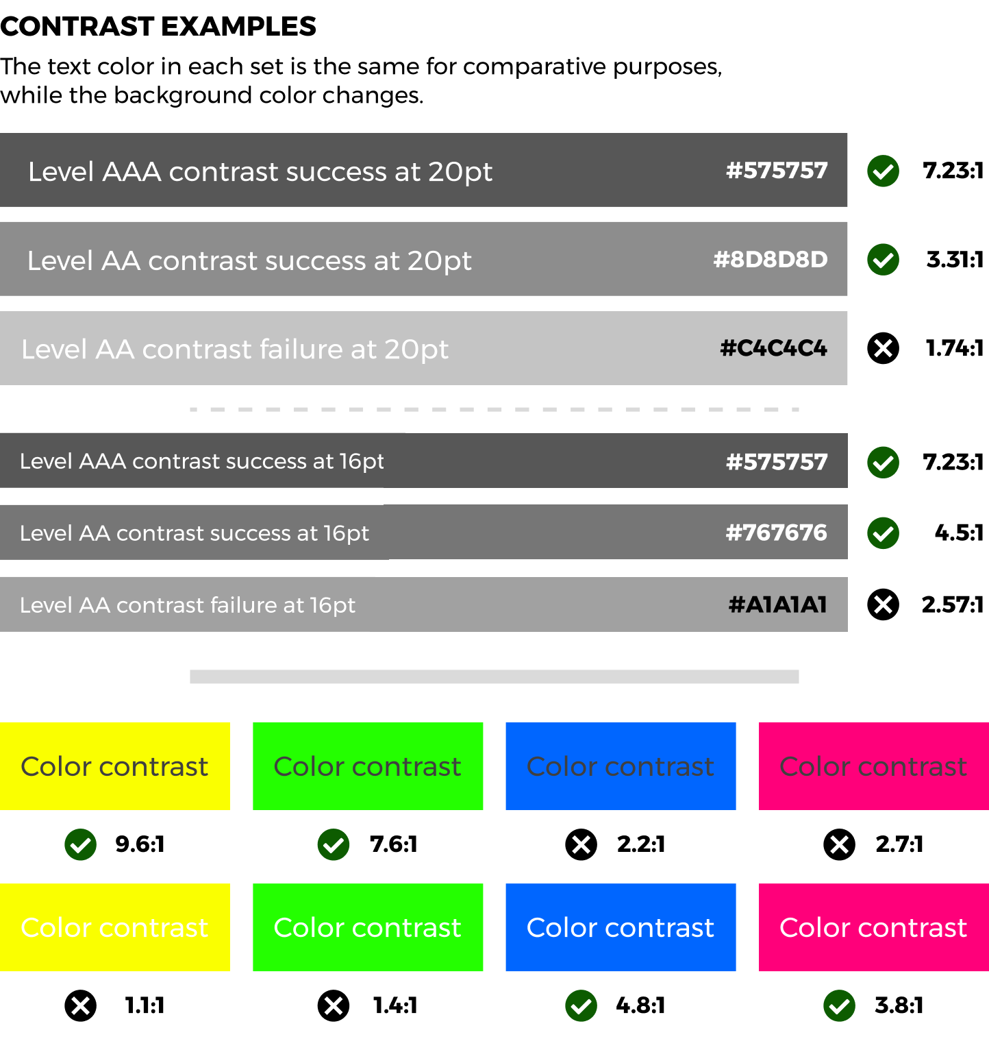
Luckily, designers can look to the Web Content Accessibility Guidelines for guidance on how these matters should be addressed. The WCAG directly sets a Contrast Minimum that designers should adhere to.
There are two specific ranges that are targeted within the Contrast Minimum:
- 3:1 - The minimum acceptable ratio for large text (18pt and above).
- 4.5:1 - The minimum acceptable ratio to be applied to everything else.
Designs that meet this minimum requirement would be rated Level AA according to the standard. The ratios in this level are meant to accomodate a user with 20/40 vision - which is typical among older adults. A higher specification, Level AAA, requires a ratio of 7:1 to accomodate users with 20/80 vision.
 Source: newpragmatic.com
Tools for testing
| Tool | Platform |
|---|---|
| Stark | Plug-in for Figma, Sketch, and Adobe XD |
| WAVE | Tool for testing any website |
| Color Oracle | Downloadable color blindness simulator |
| No Coffee | Chrome plug-in that simulates multiple vision imparements |
Color + 1
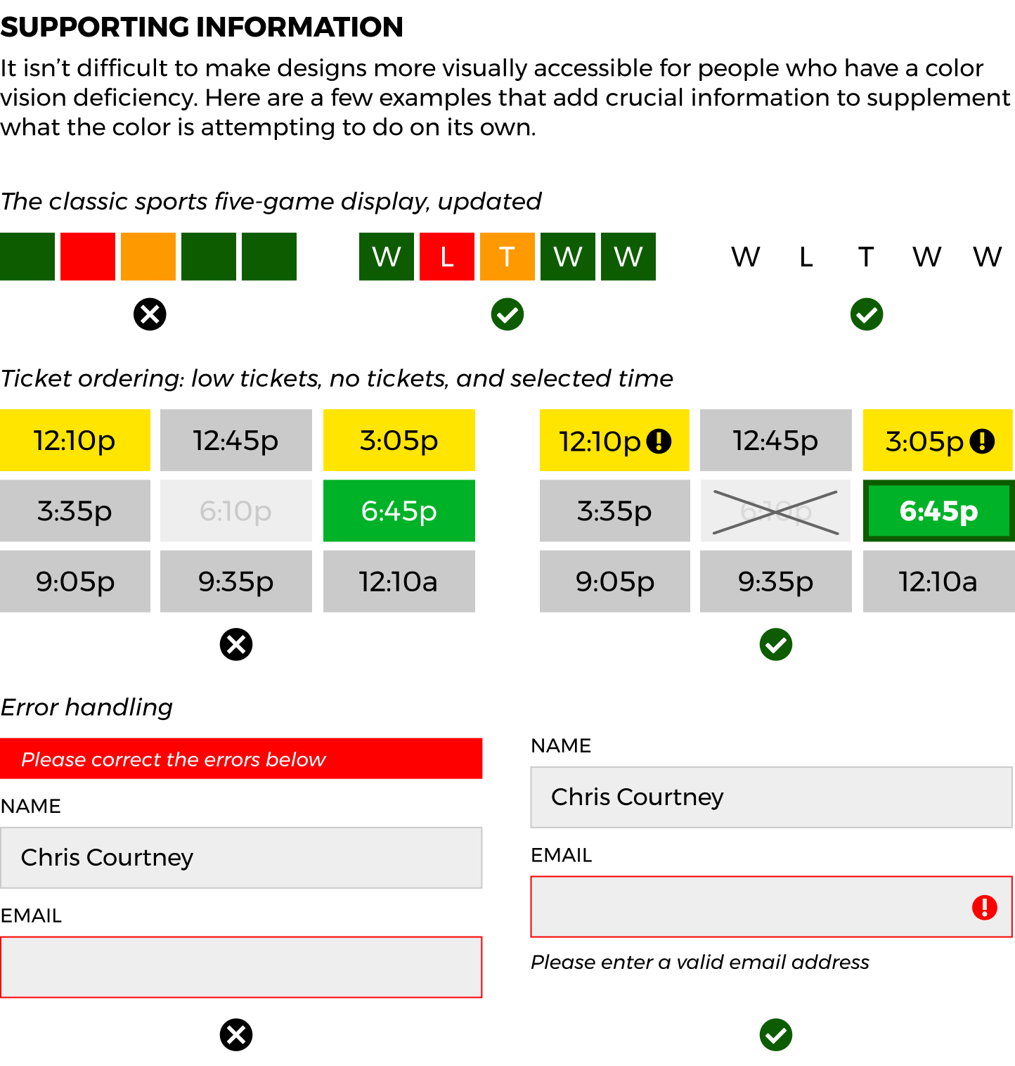
With all the possible vision deficencies that impact users, it should be clear that using color alone to provide information is a bad idea. Many design professionals have opted to address the matter by adding text or icons to support what a color would have been attempting to communicate previously on its own.
Whether a design is simply providing information for consumption or use, the examples below are a good example of how to modify design to better accomodate users.
 Source: newpragmatic.com
As displayed in the examples above, there are a number of ways to add supporting information that can assist all users. Among them, text, icons, and borders standout because they are relatively easy to add to an existing design.
There aren't as many tools to use when testing whether you have correctly added the missing information needed but there are two key questions you can ask yourself.
- Is this the clearest way I can convey this information?
- Is this design focused on communication or merely style-driven?
When you focus on communication-first, you naturally align yourself with the needs of the user — regardless of the vision limitations they may have.
Associated Exercises
| Name | Section |
|---|---|
| Color Accessibility | Interface Design |
| Color At Work | Interface Design |