Logo. Type. Images. Color. Space.
Can any combination of items be more purely visual than those listed above?
At first glance, it would appear that a successful brand is just a formula that should be easy to replicate from one organization to the next. Yet, successful brands are unique to both their industry and their user.
To stand apart from the competition, a brand must first identify who its customer is and then create an identity that resonates with them.
This is another way of saying that the best brands know who they are and create value for their customers.
Without a process, branding work can feel like you’re stabbing in the dark. Use the steps below to simplify your process and build confidence in your branding decisions:
Step 1: Think beyond logo
When working on any branding project, setting the logo aside to discuss brand will present a considerable challenge. Society conditioned us to equate these two very different things as the same.
A logo is a visual manifestation of the brand. A mark that should remind you of the brand if you see it. Visual guidelines can be applied to generate successful logos, but a logo alone can not carry a brand.
“Remove your logo from your product, your website, your app, and your ads, and your customers should still know it’s you,” designer Jon Hollamby wrote in Fast Company.
Successful brands encompass the values of an organization and, in doing so, generate a voice. When we use that voice to communicate with users, the information delivered must align with the brand’s other elements.
If a brand were just a logo, this classic campaign would have never worked.
Step 2: Understand why you are using color
I care very little about the specific colors you choose. Any combination could work. If the palette you selected helps you stand apart from a competitor, I’m on board.
I’m mostly concerned with how you use the colors you’ve selected.
As shown in the examples below, when a brand leans heavily on color, it’s typically for one of two reasons:
- Large areas of color draw a lot of attention and generate energy.
- When a concept or product is hard to visualize, we use color more extensively.
 Source: land-book.com
As seen above, bold usage of color can be useful. That doesn’t mean this approach is appropriate for all organizations.
More often than not, brands lean on color as a secondary aspect of their digital persona. This leads to a more conservative approach that allows type, photography, and space to serve as the foundation for a brand.
Even in this diminished role, color can play a critical role in successfully establishing the brand. By shifting from display to usage, the color becomes significantly more functional.
 Source: land-book.com
With two potential directions to travel, it can be challenging to identify the appropriate path forward. This is why you never just jump in and begin redesigning someone else’s work. Your understanding of the overall concept, stakeholder goals, user research, and the visual artifacts available will guide you to the correct solution.
Step 3: Be selective with typography
Establishing a brand requires that your chosen combination of elements elevate beyond the mere sum of the combined parts.
Any typeface you choose to feature in your design will significantly impact the tone of the brand. This is why brands like IBM, Samsung, and Uber commissioned the creation of custom typefaces.
 Source: newpragmatic.com
Even if you don’t have a typeface to call your own, your ability to make successful type pairings can provide a successful foundation for a brand identity. When we introduce pairing, it is assumed you’ll likely be working with more than a single typeface — and this is where you have to be careful.
Brands work because they resonate. Your type selections play a considerable role in creating the signal for a brand identity. The pages displayed below are excellent examples of how type pairing can help establish that signal.
 Source: newpragmatic.com
Type is a bit like Goldielocks. Too little or too much variation makes it challenging to establish a brand. You’re looking for a middle ground.
Two type families with plenty of weights — just right.
Step 4: Tuning Information Density
Regardless of the medium, we all struggle with information density in our daily lives. This is easiest to identify when we feel overwhelmed by the environment we’re attempting to interact with. That could be the layout of a physical store, the options displayed on an appliance, or the information presented on a website.
How we value and register information density changes significantly from one website to the next. A high-end news website like the New York Times has a high information density that most users value because it displays a depth of coverage. The same users could migrate to a shopping site like Apple and value its lower information density because it focuses on individual products.
 Source: newpragmatic.com
In an interesting twist, if we apply lower information density to a service like Apple Music, users would likely dismiss it as being poorly designed or difficult to use. The difference between Apple and Apple Music is the volume of options for consideration. The prior, a few dozen high-priced items and the later, millions of songs available with a subscription.
Another consideration about information density is you might alter it over the lifetime of the user. New users might be overwhelmed by options that an existing user would find valuable. This implies that information density isn’t static across your product or across time.
The only correct approach is one that takes into account both the product or service offered and what a user values from it.
Step 5: Don’t steal
Of course, we can’t have a branding discussion and ignore logos entirely!
Originality is a deceptively simple goal that isn’t easy to sustain over time, but you have significant control in the beginning.
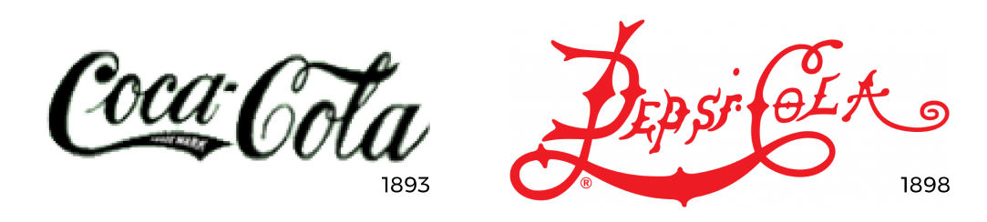
Every industry has multiple brands that perform similar roles in their sector. One of the most straightforward global examples of this is the differences between soft-drink giants Coca-Cola and Pepsi.
 Source: logodix.com
Today two titans couldn’t stand further apart from the other. Pepsi blue vs. Coke red. Modern geometric typography vs. a fantastic old-school script.
Give how distinct each brand identify is now, is a bit surprising to see what the first Coke-Pepsi battle looked like in the late 1800s.
 Source: logodix.com
That’s right, while the two companies were hundreds of miles apart in the era before phones - branding of the two shared a lot of similarities. It’s important to note that Coca-Cola was launched in 1886 while Pepsi did arrive on the market as Pepsi until 1898. More striking is how Pepsi moved closer to Coca-Cola before eventually moving away from their script logo in 1962.
 Source: logodix.com
Did the Coca-Cola logo influence the Pepsi logo? Probably.
Does it amount to stealing? No.
Is Pepsi’s branding better for migrating away from its competitor? Yes.
It would be great to be able to craft a genuinely unique brand identity. That’s a fine goal, but no one has access to all brands past and present. This lack of complete historical reference means that you could make something unique only to find out that it was similar to a random company logo from the 1970s.
Protecting yourself and your client against claims of stealing is relatively simple.
Make sure that the color, type, and logo you utilize for your brand isn’t similar to another competitor. Your knowledge of the competitive space should help you meet this threshold.
Many brands use similar colors or typefaces or logos — but it is the combination of these similarities that will draw threats of litigation.