Every step in the quest to provide structure to our information is an exercise in restraint.
As you already know, humans are not particularly well-known for following plans or being cautious. It's simply not what we do well.
That's why it is not uncommon for people to assume that UX Design begins with wireframing. To skip all the steps that have come before would leave you with literally nothing of substance to work with. The common assumption is that digital products are just figuring out where the boxes go — which is ludicrous.
None of this is said to belittle the art of wireframing, as it does play a crucial role in the development of your project. This is the moment when your work migrates from paper sketches into the computer.
Two big things occur when our work becomes digital.
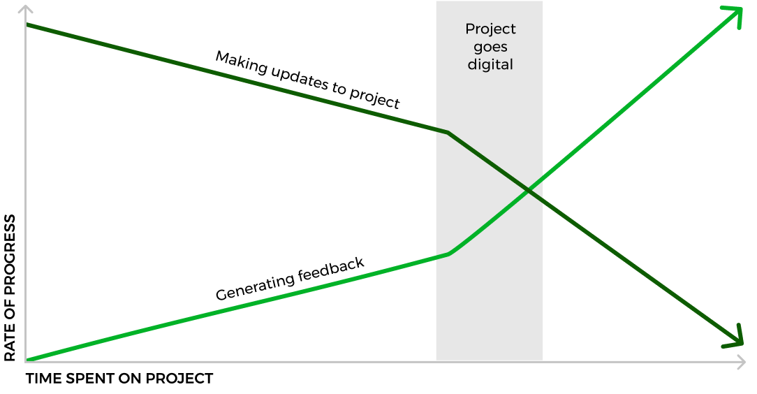
First, your work becomes easier and faster to share, both internally and externally.
Second, the investment of time and resources begin to add weight to the project. It's important to note that this weight has a tendency to move around. Sometimes this weight adds needed momentum, but it also can produce noticiable drag on your progress.
 Source: newpragmatic.com
Managing the process
Designers perform a lot of research prior to committing to any form of visual design because of the weight that begins to accumulate once our projects begin to take a visual form. When people see these early versions of our projects, many will anchor their expectations to these early rough solutions. It's important to remember that while you've been extremely busy with the project, others may be waiting for direction or already feeling the pressure of a looming deadline.
Any questions about the experience of the team or client will be exposed here. Veterans of product design won't get very excited about a set of wireframes, aside from being curious about the possible directions you are considering. That's because they know just how far from the finish line the project really is. On the other hand, individuals with little experience will become very excited, anticipating a shift in the project pace which could lead to quickly pushing the project into the market.
Regardless of how long you've been working in product design you can lead a team through this issue by properly setting expectations. In most project conversations you'll be pressed for unreasonable deadline commitments, and you should stick to one rule. Simply never overpromise.
This is quite different from the far more common business philosophy of 'underpromise and overdeliver' where you are always trying to manage expectations by applying a fictional constraint. By committing to never overpromise, your goal is to avoid backing yourself into a corner rather than focusing energy on expectation management. If you don't overpromise, you only have to deliver — therefore expectations manage themselves.
Getting the most out of your wireframes
The sketches you made during your initial exploration were rough for a reason. Speed of idea generation was the goal. On the other hand, wireframes provide a base for all the visual design work that will be done later. While these wireframes will be a level of fidelity higher, your work will still relatively simple. This is all about knowing how much time and effort to invest. There are still a lot of updates that can happen to the work, so moving it forward without overinvesting your time is the target.
Here are a few basic rules to guide your effort as you elevate your initial sketches.
Real sizes
As you transition your work into digital form, you'll have an opportunity to layer levels of fidelity atop prior work. This is only possible if you are creating your wireframes with the final dimensions in mind. The rest of the guidelines below really won't matter if your wireframes aren't created at the correct size.
Mobile and tablet sizes work within a range, so the work you build can adjust for an iOS or Android device. Tools like Sketch and Figma allow you to control how the elements respond to a change in overall size.
The same can be said for browser-based desktop designs, as you typically leverage a grid to managing your content that will assist in controlling range up to a preselected maximum size.
Getting the project sizes correct will make it far easier to update your work as the fidelity increases. Failure to meet this mark will make your prototypes difficult to construct, which negatively impacts your user tests. All this means you'll likely start from scratch as you move further into the visual design of the project.
Real copy
The copy you've already created has helped you roughly sketch out your initial ideas for the project design. Simple things like knowing how many blocks of content you need for a particular section adds reality to your work. Now we're leveling that up and bringing in the content that you created.
This is one of the first concepts to slip away when you move from pre-planned projects and into client work. To ensure future success, commit to working with real content even if that means you're writing content that might be replaced later. This forces your collaborators to address an issue they might otherwise avoid until much later in the process.
No images
Using images too early in the wireframing process impacts how your clients and collaborators perceive the work. Instead of function, people begin to focus on style and it is simply too early to have that discussion.
That doesn't mean that you won't indicate where a image is intended to go. Much like your rough sketches, images should be noted by placing an X through the box or circle where that image or icon might reside in later iterations. So it is important to know if an image is available and have an idea of what image might be used, but adding one to your early wireframes is a poor decision.
No color
Adding color too soon to your wireframes is similar to adding images too early in the process. It flips the same psychological switch that shifts focus away from function, which is the purpose of early wireframes.
This doesn't mean that your wireframes have to be just black and white. You can use gray to help indicate where a button might be or where the background might have a color or texture later. This preserves the overall structure of your design without pulling to much attention to the stylistic decisions you are making.
It is still possible to hear from early testing participants that they 'don't like' how gray the app or site is. These comments can be generally disregarded as they aren't related to aspects of the design being presented. Focus instead on issues related to usability and flow.